Issue #86: iPhone Duo is real, and your app has six weeks to earn the inner screen
Two quick announcements before the code. First, iOS Code Reviews is moving to a weekly cadence, starting now. Second, each edition will now carry three small placements, at $30 each, where you can show off the tools, Mac apps, and iOS apps you're building to 4,000 engaged iOS developers. Reply to this email to grab one (Or send an email directly to ioscodereviews@gmail.com). Let's grow!
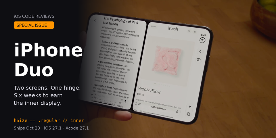
Now let's get to the exciting news from today! Apple announced iPhone Duo today, the first foldable iPhone, and it ships October 23 with iOS 27.1. Every foldState string, every resizability default, every "target a dynamic range of sizes" line from the iOS 27 betas was pointing here. Apple also dropped a Tech Talk, "Bring your app to iPhone Duo," that tells you exactly what the three SDK tiers get you and which APIs to reach for. This is a one-topic issue: the hardware, the SDK tiers, the layout rules, and the code.
The Hardware (iPhone Duo, iOS 27.1)
Two screens, one hinge. The outer display is 5.4 inches, the inner is 7.6 inches, and Apple says the inner one is "50% larger than iPhone 18 Pro Max." The form factor is wide, closer to a passport than a tall phone. The A20 Pro inside is the same chip as the 18 Pro models, so performance is not the story. Layout is.
The detail that matters most for your code: "The aspect ratio of the 7.6-inch Super Retina XDR display is consistent across the inner and outer display." Same proportions, different size. That's Apple telling you content should scale between the two states rather than re-flow into a different shape.
Pricing starts at $1,999 for 256GB. Pre-orders open Friday, October 16. Availability is Friday, October 23 in 70+ countries. Do the math on your release schedule from there.
Apple unveils iPhone Duo "Both displays share the same aspect ratio for proportional content scaling."

What iOS 27.1 Does to Your App (iOS 27.1)
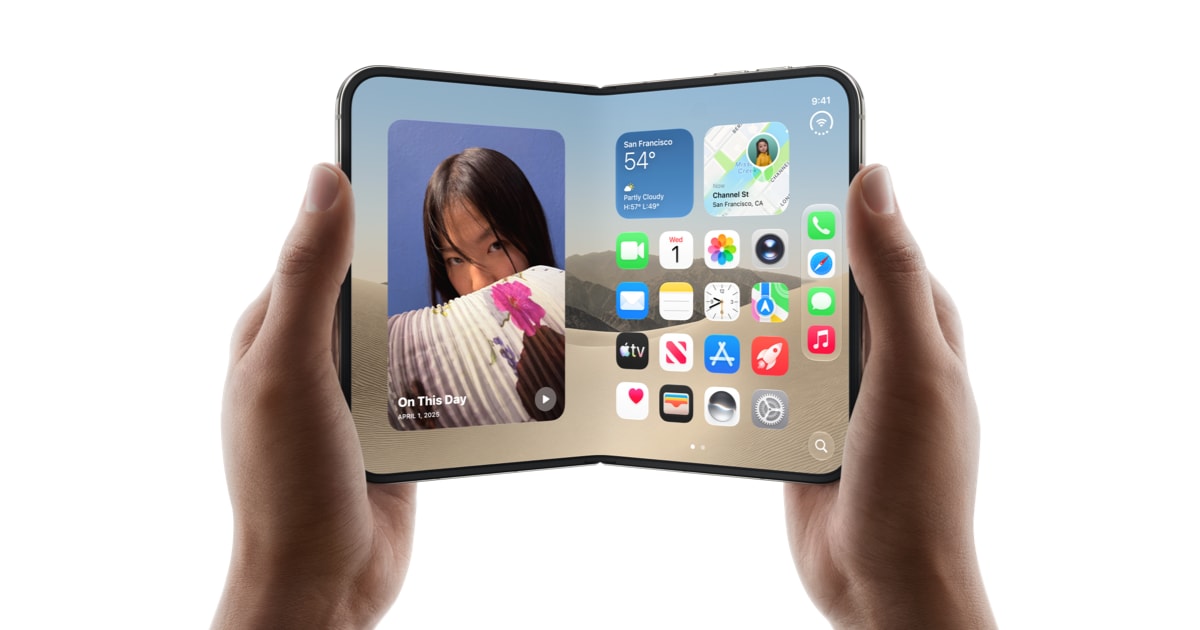
iOS 27.1 is the Duo release, and it rearranges the chrome. Per Apple, "Lock Screen controls, the Dock on the Home Screen, and app navigation and controls now appear on the side." The Dynamic Island is redesigned vertically for the folding display. Split View puts "two apps side by side on iPhone for the first time," users can "open two windows of the same app, like Safari," and app pairs can be saved.
Read that again: two windows of the same app, on an iPhone. If your app declares itself single-scene, it is opting out of a headline feature on a $1,999 device.
iPhone Duo "Use two apps side by side with Split View multitasking."

Three SDK Tiers, Three Very Different Apps (iOS 27.1 SDK)
The Tech Talk lays out what you get at each build target, and it's worth being precise because the difference is visible from across the room.
Built against anything before iOS 27: your app works. On the outer display it uses the space to the left of the status bar and camera. On the inner display it renders at "a familiar size and aspect ratio," which is a polite way of saying centered with unused screen around it.
Built against iOS 27: the resizing work you did for iPhone Mirroring pays off, and the app extends to the left of the status bar area on the inner display.
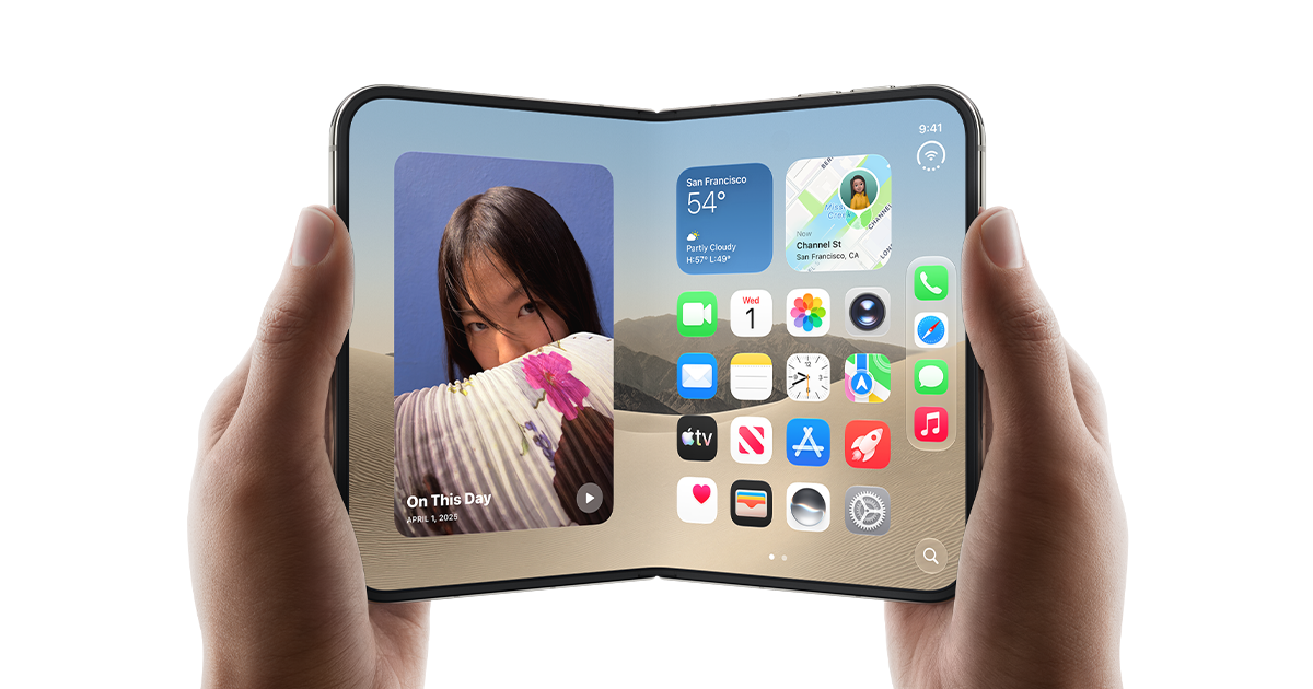
Built against iOS 27.1: "your app extends to the edge of the screen. Standard navigation and toolbar buttons now lay out vertically under the status bar." That's the full-screen tier, and it's the only one that looks like it belongs on the device.
Getting there is Xcode 27.1 plus Device Hub, which already has an iPhone Duo simulator: "Use the control buttons at the bottom of the screen to open, close, rotate, or fold iPhone Duo." No waiting for hardware to test every pose.
Bring your app to iPhone Duo "When you build your app with the iOS 27.1 SDK, your app extends to the edge of the screen."
Size Classes Are the Whole Game (iOS 27.1)
Apple's guidance is blunt: don't branch on idiom, don't branch on orientation, don't touch the main screen. The Duo is an iPhone that reports regular-by-regular size classes when open, and the inner display "doesn't honor your supported interface orientations." Orientation checks will lie to you. UIScreen.main is ambiguous on a two-screen device and "will be deprecated in a future release."
Here's the size class map. Outer display: compact horizontal and regular vertical in portrait, compact-by-compact in landscape, same as every other iPhone. Inner display: regular horizontal and regular vertical, so sidebars and multi-column layouts are on the table. In SwiftUI, read it from the environment:
struct FeedView: View {
    @Environment(\.horizontalSizeClass) private var hSize

    var body: some View {
        if hSize == .regular {
            HStack(spacing: 0) {
                FeedList()
                Divider()
                FeedDetail()
            }
        } else {
            FeedList()
        }
    }
}
In UIKit, read traitCollection.horizontalSizeClass and register for changes with registerForTraitChanges. If you have UIScreen.main.bounds anywhere, replace it with the window scene's bounds, or the view's own bounds, and access the screen through UIWindowScene only if you truly need it.
Two plist notes from the talk that reverse what I'd assumed. UIRequiresFullScreen is still honored, "but your app will still resize when someone opens or closes their iPhone Duo." And your supported interface orientations are respected, "but your app will scale on the inner display, including in Split View multitasking." Neither key is an escape hatch. Both just make your app worse on the inner screen.
SwiftUI: NavigationSplitView and Sidebar Tabs (iOS 16+ / iOS 18+)
Apple's recommendation for adapting across every pose is standard navigation containers. NavigationSplitView and UISplitViewController collapse to a single stack when closed and tile when open. For a list-detail app this is the cheapest win available:
struct RootView: View {
    @State private var selectedArticle: Article?
    @State private var columnVisibility: NavigationSplitViewVisibility = .automatic

    var body: some View {
        NavigationSplitView(columnVisibility: $columnVisibility) {
            ArticleListView(selection: $selectedArticle)
                .navigationTitle("Headlines")
        } detail: {
            if let article = selectedArticle {
                ArticleDetailView(article: article)
            } else {
                ContentUnavailableView("Select an article", systemImage: "newspaper")
            }
        }
    }
}
Keep selection state at the top so the detail pane survives the fold-to-unfold transition instead of resetting.
TabView adapts too. Tabs appear on both displays and lay out vertically when the system decides that fits. On the inner display you can opt into a sidebar:
TabView {
    Tab("Home", systemImage: "house") { HomeView() }
    Tab("Search", systemImage: "magnifyingglass") { SearchView() }
    Tab("Library", systemImage: "books.vertical") { LibraryView() }
}
.tabViewStyle(.sidebarAdaptable)
.defaultAdaptableTabBarPlacement(.sidebar)
UIKit gets the same behavior by setting the tab bar controller's preferred placement to sidebar. Sheets, popovers, context menus, and alerts all adapt per pose without your help. On the outer display, sheet buttons can stack vertically. On the inner display, sheets are centered.
Safe Areas Are Asymmetric Now (iOS 27.1)
This is where apps with custom bars will break. Standard navigation bars, toolbars, and tab bars sit outside the safe area and route around the status bar and the camera on their own. "Horizontal bars provide top and bottom insets, while vertical bars provide leading and trailing insets." If you draw your own chrome, you own that math.
The rule from the talk: foreground, interactive content inside the safe area, background content free to bleed past it. SwiftUI does the first by default and ignoresSafeArea() does the second. UIKit is safeAreaLayoutGuide for controls and the view's bounds for artwork. The catch is that "safe areas are often asymmetric. This is especially true on iPhone Duo." Vertical buttons can land on the left in landscape and in Split View, so any code that reads one inset and mirrors it to the other side is wrong:
// Wrong: assumes symmetry
let horizontalInset = view.safeAreaInsets.left
contentView.frame = view.bounds.insetBy(dx: horizontalInset, dy: 0)

// Right: handle each edge on its own
let insets = view.safeAreaInsets
contentView.frame = CGRect(
    x: insets.left,
    y: insets.top,
    width: view.bounds.width - insets.left - insets.right,
    height: view.bounds.height - insets.top - insets.bottom
)
Layout margins are asymmetric for the same reason. Test it in Device Hub: open the inner display, drag your app by the home indicator to one side to enter Split View, then drag it to the other side. Vertically laid out content can appear on either edge.
For edge-to-edge UI and fully custom bars, iOS 27.1 adds ReservedRegion in SwiftUI and UIViewReservedRegion in UIKit, which let you "safely position UI elements outside the safe area while maximizing usable space." The details are in the companion talk, "Strike a Pose with Adaptive Layouts on iPhone Duo."
Corners matter too. The Concentricity APIs from iOS 26, ConcentricRectangle in SwiftUI and UICornerConfiguration in UIKit, have been updated for the Duo's screen shapes. If you hardcoded a corner radius to match the display, that number is stale on both screens.
UIKit: Multiple Scenes, or No Second Window (iOS 13+)
"Two windows of the same app" runs on the scene system that's been in iOS since 13. If you never opted in because it was an iPad feature, this is the flag:
<key>UIApplicationSceneManifest</key>
<dict>
    <key>UIApplicationSupportsMultipleScenes</key>
    <true/>
</dict>
Turning it on means your app has to survive two scenes sharing one process, which is exactly the kind of thing @Observable at property granularity (Issue #85) makes tolerable. Shared model, two windows, only the views that read a changed property redraw. If your state lives in a singleton that assumes one visible screen, fix that before you flip the flag.
Xcode 27.1: The App Resizability Skill
The app modernization skill from "Modernize Your UIKit App" at WWDC26 has a new name in Xcode 27.1, App Resizability, and it now covers SwiftUI and iPhone Duo. Point an agent at it, whether through Xcode's built-in assistant or the headless MCP server from Issue #85, and it audits your project for the idiom checks, main-screen references, and symmetric-inset assumptions above. It won't fix a bad information architecture, but it will find the UIScreen.main.bounds you forgot about in a view you haven't opened since 2021.
What to Do This Week
Install the iOS 27 RC and Xcode 27.1. iOS 27 ships to the public Monday, September 14, so the RC is what your users get in five days. Open your app in Device Hub on the iPhone Duo simulator and cycle every primary screen through open, closed, rotated, and folded, then drag it into Split View on both sides. Run the App Resizability skill and clear its findings. Anything with a list-detail flow gets NavigationSplitView. Anything reading UIScreen.main gets the scene bounds instead. Any custom bar gets asymmetric inset handling or a ReservedRegion. Decide, deliberately, whether you support multiple scenes. Rebuild against the 27.1 SDK and ship before October 16 so the update is live when the pre-order crowd unboxes.
Apple Seeds iOS 27 and iPadOS 27 Release Candidates iOS 27 RC is out today, with the public release on September 14.
 Juli Clover
✌️
Alright, that's it for today! Let's spread the good code vibes ✨🧘🌈☀️
The foldable hints we've been tracking since June are now a $1,999 product with a ship date, and the six weeks between now and October 23 are the whole window.
Come share your Duo plans in the comment section on the website!
Member discussion